
Microsoft is now implementing an Xbox Series S and Xbox Series X modification that has been quite overdue as far as fans are concerned.
Early adopters have criticized the home screen of the two Xbox systems since they were released in 2020.
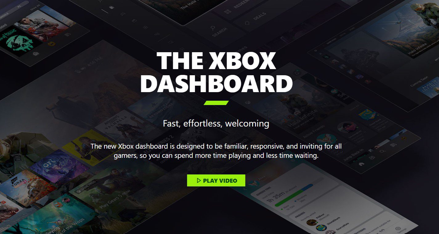
The Xbox Series X|S home screen is identical to the revamped Xbox One interface, which was introduced not long before Xbox Series X|S, therefore technically these concerns began on the Xbox One before this.
After a few more years, Microsoft has made adjustments that are now being tested and has openly acknowledged the problems with the design.
Despite the fact that these changes haven’t yet been implemented, we are aware of their appearance because they have received both formal and informal previews.
The primary criticism of the current design, which is being replaced, is that the icons obstruct the background and make the screen appear cluttered.
In addition, complaints have been made about icons that are nothing more than advertisements. In response, Xbox fans have demanded that these be changed or at the very least made more customizable.
The redesign does shrink the icons and move them to the bottom of the screen, but the latter two requests have not been taken into consideration.
The end result is a significantly more minimalist design, to which many Xbox fans have responded positively.
Content creator and Xbox fan account Klobrille says that “After using it for some time now, the new Xbox Home feels fantastic. Dynamic Backgrounds really shine here. I did provide some Xbox Insider feedback on smoother/faster background transitions and more, but this is on track to be one of the best Xbox Home screens yet.”
After using it for some time now, the new Xbox Home feels fantastic. Dynamic Backgrounds really shine here.
I did provide some Xbox Insider feedback on smoother/faster background transitions and more, but this is on track to be one of the best Xbox Home screens yet. pic.twitter.com/iXuttryYQx
— Klobrille (@klobrille) May 7, 2023
As to be expected, many people agree with this viewpoint; however, others aren’t as impressed, citing a variety of factors such as the ads, the uneven symmetry of the two rows of icons on the screen, and more.
Of course, as far as the design is concerned, not everyone will be pleased, but it appears there has been enough unfavorable feedback to indicate there is still room for improvement.
Having said that, there is no denying that this is a significant step in the right direction even though it may not be 100 percent exactly what fans have been wishing for.
User Matthew Garbett posted that “I wish they’d just make the second row the same size as the top row. Hopefully Beta ring gets it ASAP though.”
“I think underneath the main home/tom screen, it’s still too bloated of necessary stuff like Store news, membership suggestions etc. Only 2 pins max, + the pin tabs only display AFTER, Gamepass recently added tab? Why? I already pay for GP, I know which games I want to play or…,” Aurélien Tessier tweeted as well.
PawPaw Swag made it very clear that “nah still not it. Need to remove the apps from the recently used row. need to either let us resize tiles or make the sponsored row smaller.”